Selecting Exterior Colors 101
Three characteristics organize all colors. These attributes are hue, value, and intensity. Now don’t click away because you think I’m about to get all scientific on you. I’m not. These are the technical terms for how you already talk about color daily. If you’ve ever described a shade of paint as light blue-gray or deep dark green, you’ve expressed all three of these attributes.
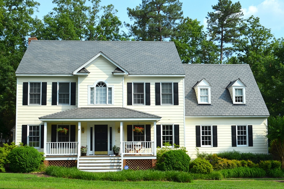
This home featuring DaVinci Single-Width Slate has chosen colors where the hue, value, and intensity work nicely together.
Step 1: What Hue is Right for You
Hue, also known as color, refers to the colors of the spectrum — red, orange, yellow, green, blue, and violet. The 12-step color wheel below includes those six colors plus the intermediate hues — red-orange, yellow-orange, blue-green, blue-violet, and red-violet. Browns and neutrals are not pure colors like those shown below. They are a blend of several colors.

When selecting your exterior color palette, begin with one color and build from there. For instance, if you want blue, recognize that there are many different blues. Some lean greener, and others are more purple. Here are some examples using a few of Benjamin Moore’s blue paint colors.

The center dollop, Bedford Blue, is classic blue. Naples Blue on the left is also a medium blue but leans toward green, and another similar color, Blue Heron, leans more purple. Light blue will reflect more light than dark blue. If trees surround your house, it won’t receive lots of natural daylight, and a paler shade can help your home stand out.
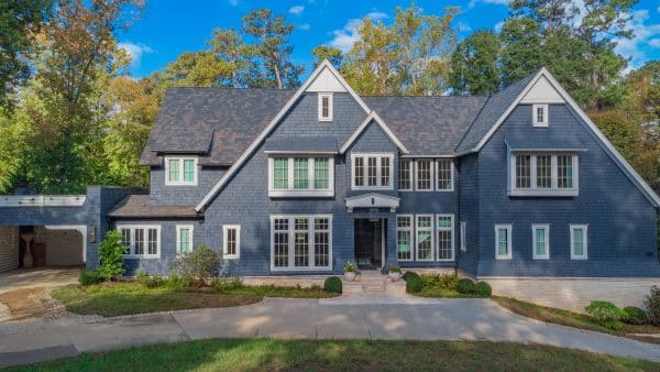
 DaVinci Roofscapes Smokey Gray Slate composite roofing tiles go beautifully with a medium blue that leans green paired with darker blue-green accents and light neutral gray trim.
An award-winning exterior featuring DaVinci Roofscapes Select Shake in Black Oak
If your home has attractive architectural details, a darker color with light trim will highlight those features.
Step 3: Deep and Dark, Light and Neutral, or a Shade In Between
The last step is to find the right intensity. Intensity is the attribute of color that expresses its brightness, saturation, or purity. High-intensity colors are clear, pure, brilliant, bright, rich, bold, or vivid. Less intense or saturated colors are toned-down, soft, muted, subtle, misty, dull, drab, or dusty. The closer colors are to their pure hue, the higher their intensity.
Looking at some more Benjamin Moore blue paint colors, look at the intensity of these swatches:

Ol’ Blue Eyes is in the center. By comparison, Big Country Blue on the left is more intense, making it bolder and brighter. New York State of Mind on the right is less intense and closer to deep gray than Ol’ Blue Eyes. A lower intensity or muted version of the color will generally give you better results when selecting your primary exterior paint color. Higher-intensity colors can be beautiful as accent colors.
When Selecting Colors, Always Confirm Your Choices
If you were to look at a home painted in a way you love and then went to the store to find the actual color, I bet you’d be surprised at how blah it looks compared to what you expected. The beauty of many paint colors may not be apparent when looking at a small sample, especially under a store’s artificial lighting.
Many homeowners change their minds during the paint sampling process. The color they love on the swatch may be considerably bolder than envisioned, while a shade they thought was unexciting comes to life once the color covers a larger area. For this reason, it is essential to look at samples of each color and material as large as possible in the lighting surrounding your home.
When looking at a paint color, apply it directly to the house and cover a generous section. Stand back about 15-20 feet to determine if you find the color appealing at different times of the day. Sampling is the only way to confirm you’ve made the right choice.
When looking for a new roof, you should do the same thing. Obtain samples from your roofer (or call DaVinci’s Customer Service Department) for actual samples of the roofing color tiles you are considering. Place them either on your roof or alongside your home. View them for several days at various times to see which colors you like best.
When selecting exterior home colors, sampling is the only way to confirm you’ve made the right choice.
Even More FRESH Ideas for Selecting Colors for Your Home Exterior
- For more help finding the perfect color scheme for your home, our ebooks offer easy-to-follow processes for choosing the colors in every part of your home. Download a free ebook
- Visualize from roof to ground the products and colors that complement your home. Go to the DaVinci Color Visualizer
- See pictures of homes and buildings that feature DaVinci Slate and Shake. Visit the photo gallery
About the Author
Kate Smith is an internationally recognized color expert, consultant, and designer. She is a skilled colorist & a color consultant who, for more than a decade, has lent her expertise to DaVinci Roofscapes. Kate helps YOU select colors you will love for many years.